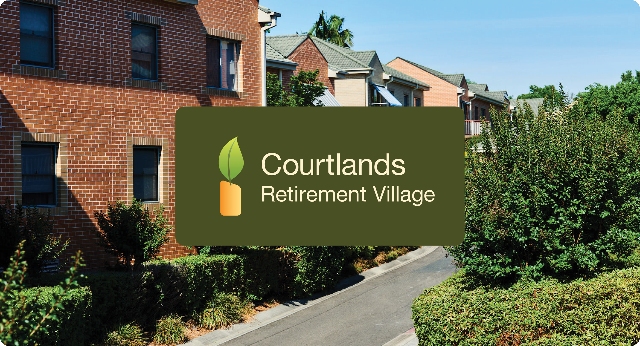
Courtlands Retirement Village is a vibrant community in North Parramatta. Their units are designed for independent living, with the added peace of mind of support close by. Residents can enjoy magnificent gardens and can relax knowing the village is secure.
I worked with Nugget Digital to refresh their branding so it is suitable for marketing materials, and roll it out onto a range of informational documents, brochures, facebook posts and editorial advertisements.
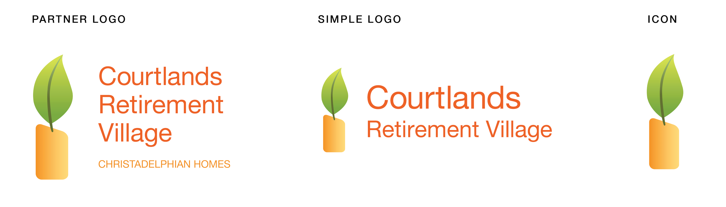
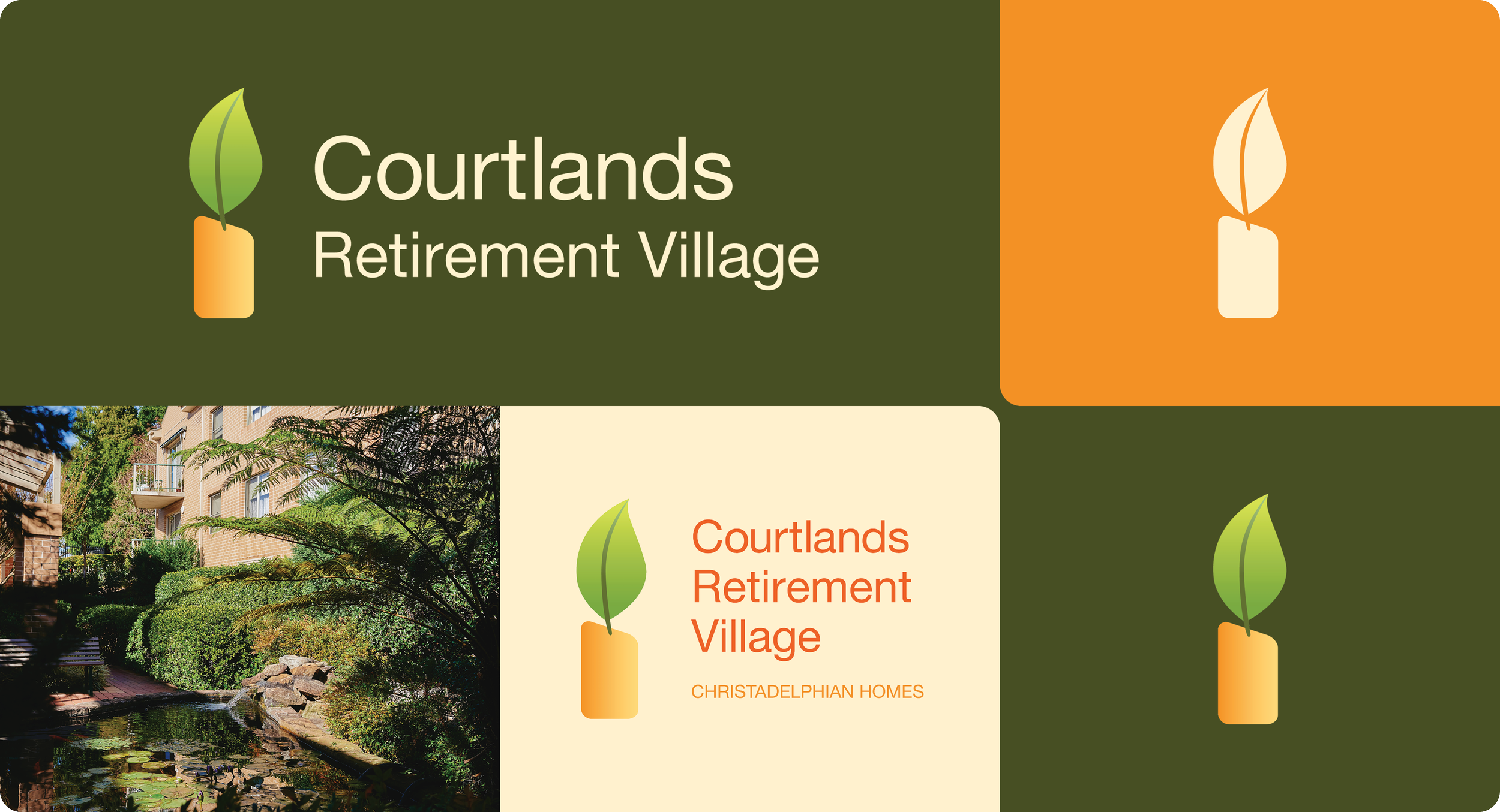
Logo Suite
Icon remained the same, with logotype being refined to ensure legibility. The logo was to be kept as similar as possible.
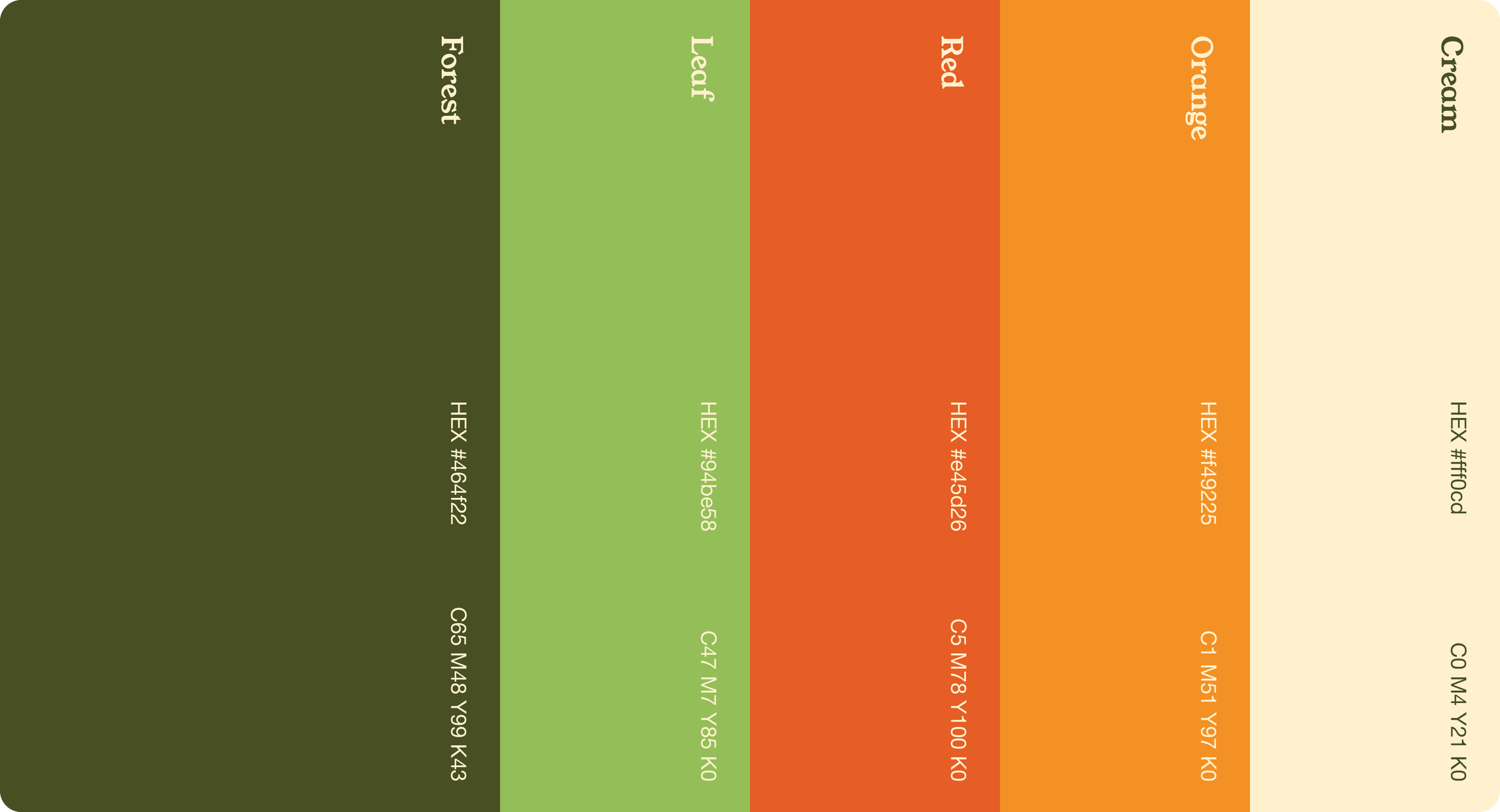
Colour Palette
The colours used in the colour palette were more or less the same, but the Forest green was highlighted to add a modern feel to their collateral.
Typography
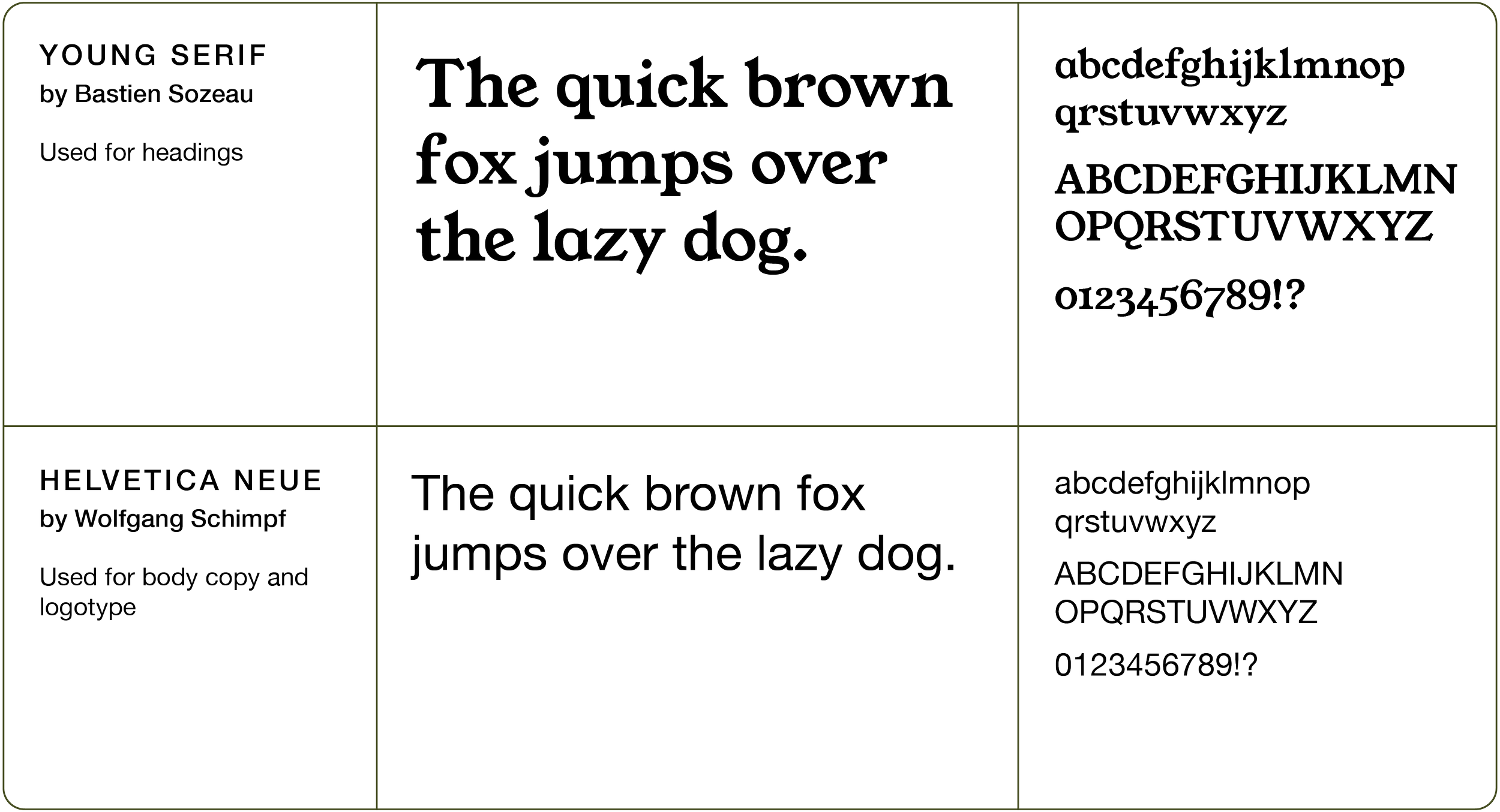
Helvetica Neue was kept for body copy to tie in with the logotype. Young Serif was added to the family to add a fresh and interesting elements to their designs.
Logo Application
The simple logo is used primarily, often found on Forest green. The main logo is used when more context is required. The icons can be used as a graphic element in the full gradient option or as a silhouette.
Document Design
Many documents were created for Courtlands, some were cosmetic updates and some were new. This enabled consistency among their collateral. From informational brochures, FAQs, floor plans and letterheads.
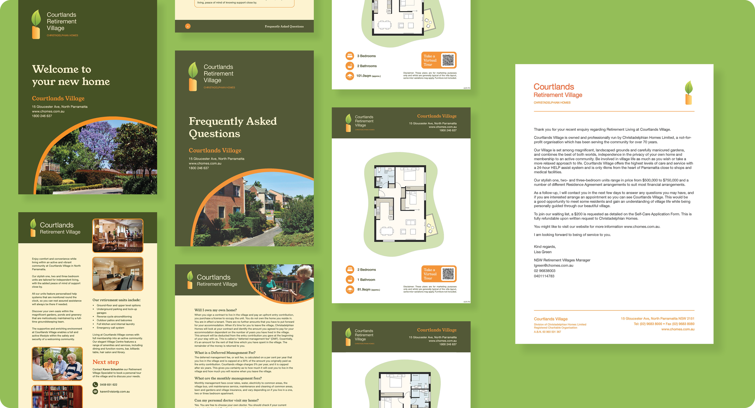
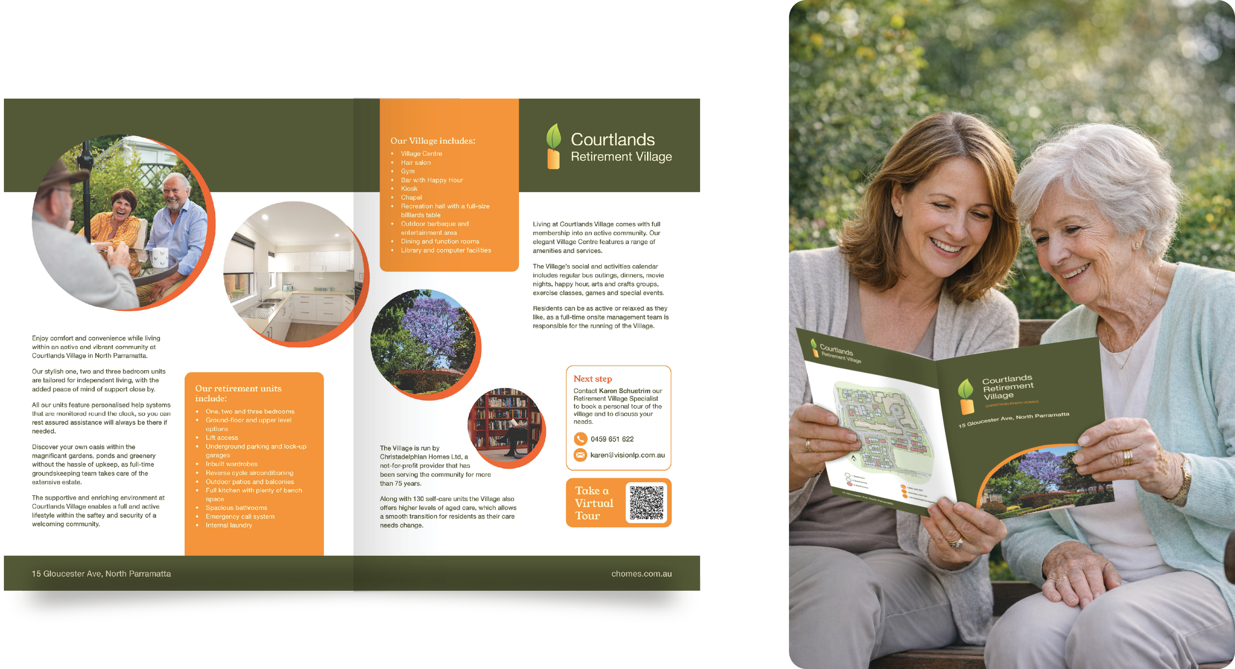
Brochure
A brochure was created to encourage potential residents to get in contact with their Retirement Village Specialist. It featured circle framing devices and layered orange informational panels.
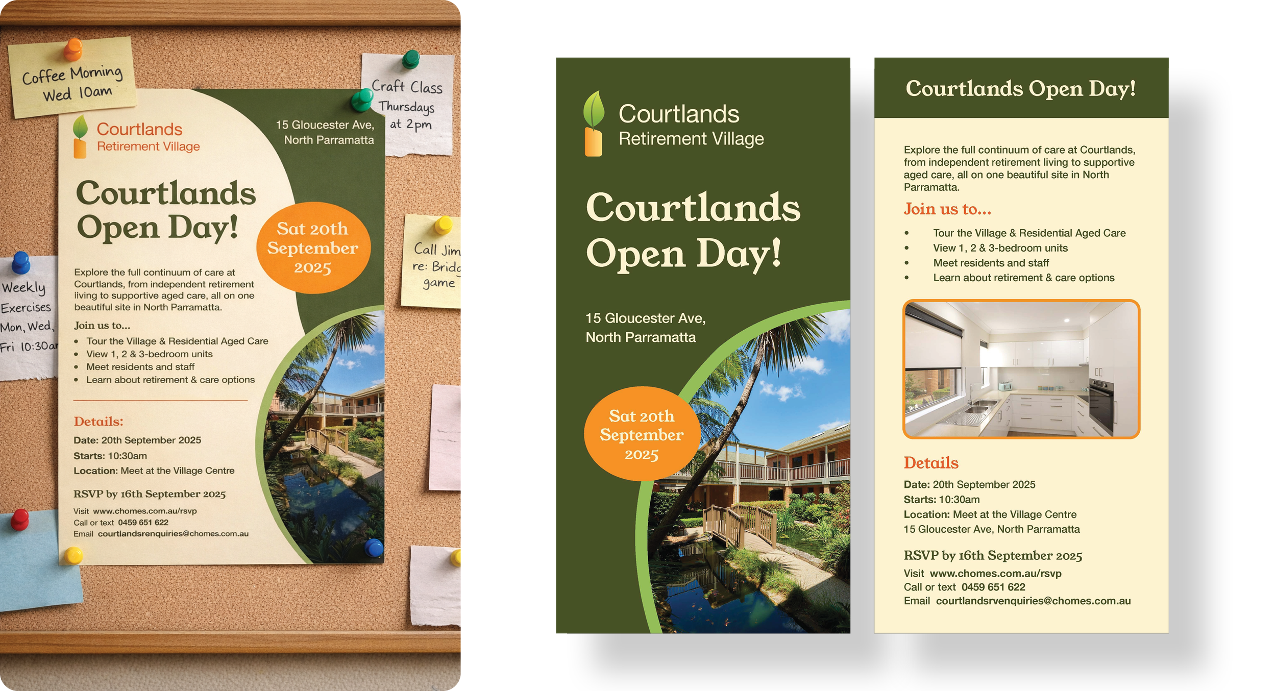
Open Day Marketing Materials
For their 2025 open day, an A4 poster, DL flyer and Facebook posts were created to promote the event.